Chroma: A Chunky Display Font for Bold Brand Statements
I was staring at a blank brand board for a new, local micro-roaster coffee shop. The brief was clear: the identity needed to feel grounded and authentic, but with a modern, urban edge that would appeal to a younger, discerning crowd. On my screen, a stack of sans-serif options looked competent, but safe. I dragged in a sample logo concept using a heavier, traditional slab serif, and it felt a bit too rustic. The project was hovering in the middle, lacking a decisive punch. That’s when I remembered Chroma, a bold and chunky display font I’d downloaded a while back but hadn’t tested in a real-world context. I typed the shop’s proposed name—“Brickhouse Coffee”—into the artboard and swapped the font to Chroma. The effect was immediate. The letters locked into place with a substantial, confident weight. The blank canvas suddenly had a focal point with personality.
The Visual Character of Chroma: Chunky Confidence
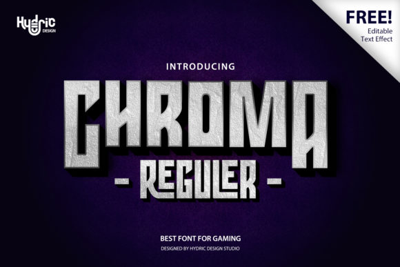
Chroma is unapologetically a display typeface. Its primary characteristic is that chunky, almost block-like construction. Each letterform carries a significant visual weight, creating a solid presence on any layout. The term “bold” here isn’t just a weight name; it’s a description of its attitude. The letterforms feel incredibly authentic—they aren’t overly stylized or tricked out with unnecessary decorative details. Instead, they rely on clean, strong shapes and consistent stroke widths to deliver impact. This gives Chroma a personality that’s confident, direct, and slightly industrial, yet versatile enough to avoid feeling cold or overly mechanical. The mood it sets is one of reliability and standout clarity, perfect for brands that want to be seen as robust and memorable.
In my test, I quickly moved from the logo draft to other assets. On a packaging mockup for a 12oz coffee bag, Chroma for the brand name anchored the design, making the label feel premium and substantial. On a business card, the font held its own even at a moderately reduced size, ensuring the key contact information was the first thing you noticed. For a website header, it created a powerful visual hierarchy, instantly communicating the brand’s core message before a user scrolled.
Chroma in Action: From Logo to Social Layout
The true test of any display font is across a brand system. Here’s how Chroma performed in my realistic branding exploration:
- Logo Design: Its chunky nature makes it a prime candidate for wordmark logos or as the dominant element in a combined logo. For Brickhouse Coffee, it provided a foundation that felt both modern and timeless. I wouldn’t use it for a delicate, feminine script logo, but for brands with names that benefit from a strong, architectural feel—cafés, breweries, workshops, creative studios—it’s excellent.
- Brand Identity & Packaging: On product labels, posters, and flyers, Chroma commands attention. It’s ideal for headlines, product names, or key calls to action. On a social media graphic announcing a new blend, the font made the post stand out in a feed without relying on overly busy imagery.
- Web Design: As a headline font for hero sections, Chroma is powerful. However, due to its heavy weight, it’s strictly for display purposes. It should never be used for body text, navigation menus, or lengthy paragraphs, as readability would suffer dramatically.
- Commercial Assets: For things like shop signs, event banners, or merchandise (t-shirts, mugs), its boldness ensures legibility from a distance and a strong brand imprint.
Where Chroma Might Not Fit
A practical review must also consider limitations. Chroma is a specialist. Its strengths in large-scale display mean it has clear weaknesses elsewhere.
- Long Body Text: Absolutely unsuitable. Its chunkiness would create a dense, difficult-to-read texture in paragraphs.
- Small Sizes: On very small print, like footer text or detailed terms on packaging, the letters can lose their definition and become muddy.
- Formal Corporate Use: For a law firm, financial institution, or any brand requiring a sense of sleek, lightweight sophistication, Chroma would likely feel too heavy and imposing.
- Extended Logos: If a brand name is very long, using Chroma for the entire logo could result in an overly wide, cumbersome lockup. It might work better for shorter names or as an acronym.
The key is to use Chroma as the accent—the spotlight element—within a larger typography system.
Practical Pairings and System Building
Since Chroma carries so much visual weight, it needs a supporting cast. In my brand board, I paired it with a clean, geometric sans-serif for all body copy, menu text, and explanatory paragraphs. This created a clear contrast: Chroma for the big statements, the sans-serif for the details. A neutral serif could also work well for a more editorial feel, say for a café’s story section on their website. Pairing Chroma with a script or handwritten font would be challenging unless the script is equally bold; a delicate script would be visually crushed by Chroma’s presence. The best pairings are simple, clean typefaces that provide readability and space, letting Chroma do its job as the bold, charismatic headline actor.
Before You Commit: A Designer’s Checklist
If you’re considering Chroma for a client project, a few steps are essential:
- Test on Actual Mockups: Don’t just look at it in a font menu. Place it on your logo concept, packaging template, and website header mockup. See how it interacts with your imagery and color palette.
- Check Scaling: Test it at the sizes you’ll actually use—from the large sign size down to the business card size. Ensure it remains legible and retains its character.
- Review Licensing: Always verify the commercial font license. Confirm it covers your intended use: client brand identity, packaging, merchandise, web embedding, and any digital or print-on-demand products. This is a non-negotiable step for professional work.
- Build the Full System: Immediately sketch out the rest of your typography system. Choose your body and supporting fonts alongside Chroma to ensure a cohesive, functional hierarchy.
In the end, my experiment with Chroma for the coffee shop project convinced me. It provided that missing piece—a typeface with enough authentic character to ground the brand, and enough bold, chunky confidence to make it stand out in a crowded market. It’s a font that asks for a bit of thoughtful system building around it, but rewards you with a powerful, memorable anchor for your most creative brand ideas.